Backoffice experience redefined

With a challenging timeframe, I was tasked to redesign the back-office platform from their intial design when it is in the middle of development. I also created a style guide from the ground up and communicated directly with the developers to ensure design governance.
Client
[Redacted]
Duration
1 month
Tools
Sketch, Abstract, Zeplin
Methodology
User Experience, Visual Design
Background
Pear is a back-office platform for employees to better manage their product and keep it running end to end. Designed from the ground up, the platform provides visibility on customer data, allows the employees to manage campaign materials, and controls communication to their customers.
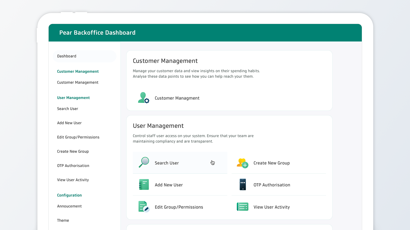
Designing the dashboard
I had to redesign the existing dashboard within a short timeframe. This was made even challenging as the developers had already started developing the initial design.
I looked into the structure of the existing screens and came up with a template that can be used throughout the design without compromising the developers' effort.
During this opportunity, I relooked into the screens and improved on the content hierarchy for a better user experience.

Style Guide
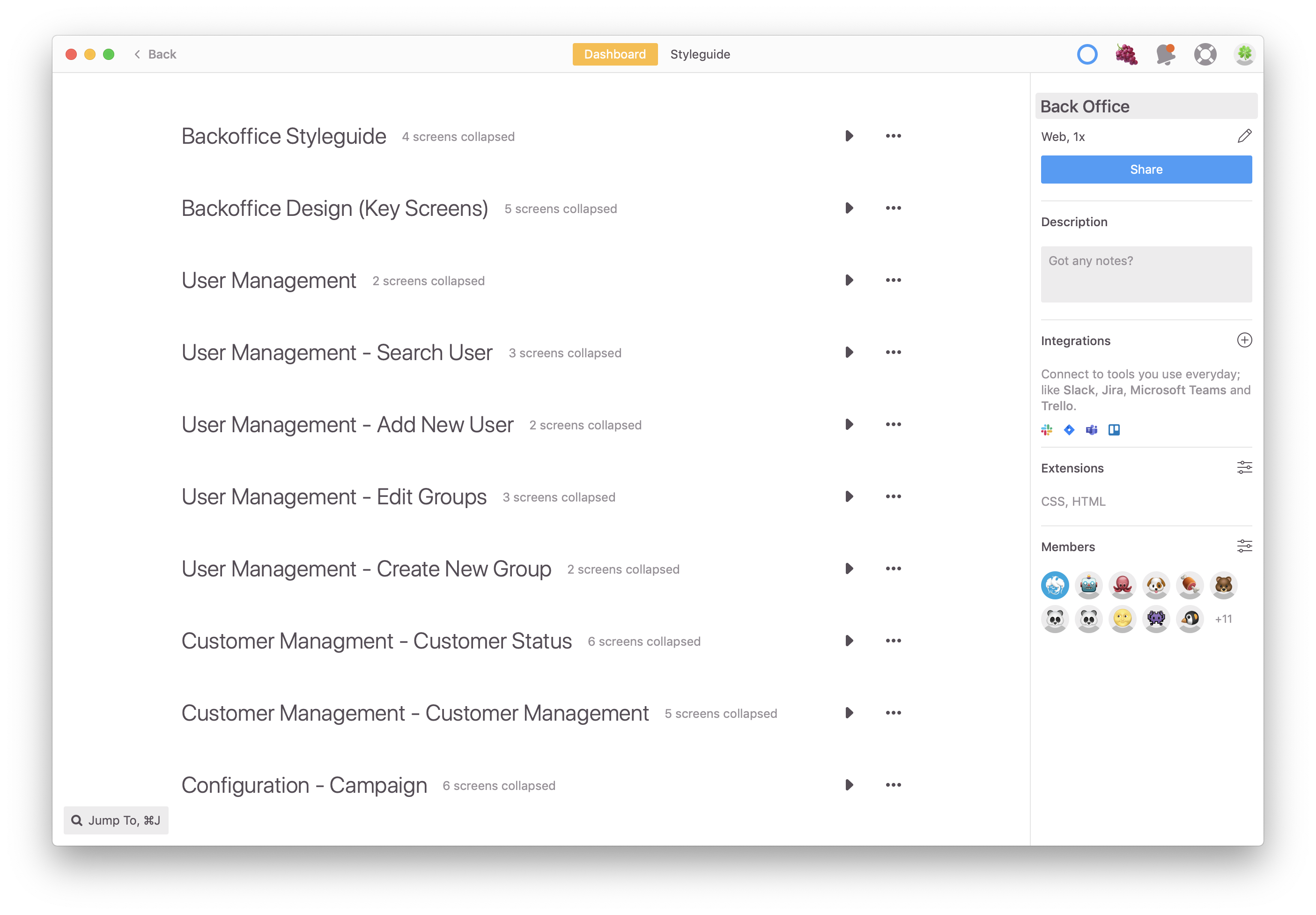
A design style guide was created to govern the design of the platform. This style guide was linked to Zeplin 2.0, where developers can view all common components such as tables and spacing.
Outcome
The entire dashboard was redesigned within a month and developer's effort for the redesign was kept to a minimum.