New Next Banking for the Citizens
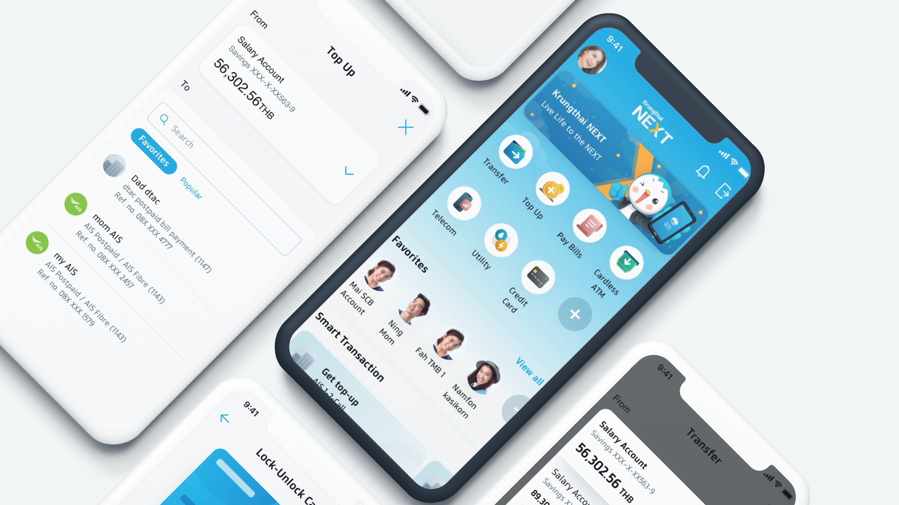
I was the design system lead for the project. As a brand new project, I laid the design foundations that were eventually adopted into many of the bank's sub businesses. We conducted design ideation workshops to understand the business and vision of the project. These insights were crucial when we built the design language, ensuring each component elevated the user experience.
CLIENT
Krungthai Bank
DURATION
1.5 years
TOOLS
Sketch, Abstract, Zeplin, Jira
METHODOLOGY
User Experience, Visual Design, Design Systems
Background
A national state bank was looking to reinvent itself starting with its mobile application. Working closely with the in-house experience team in Bangkok, Thailand; our challenge was to create a product that makes banking personal to the daily lives of Thai users.
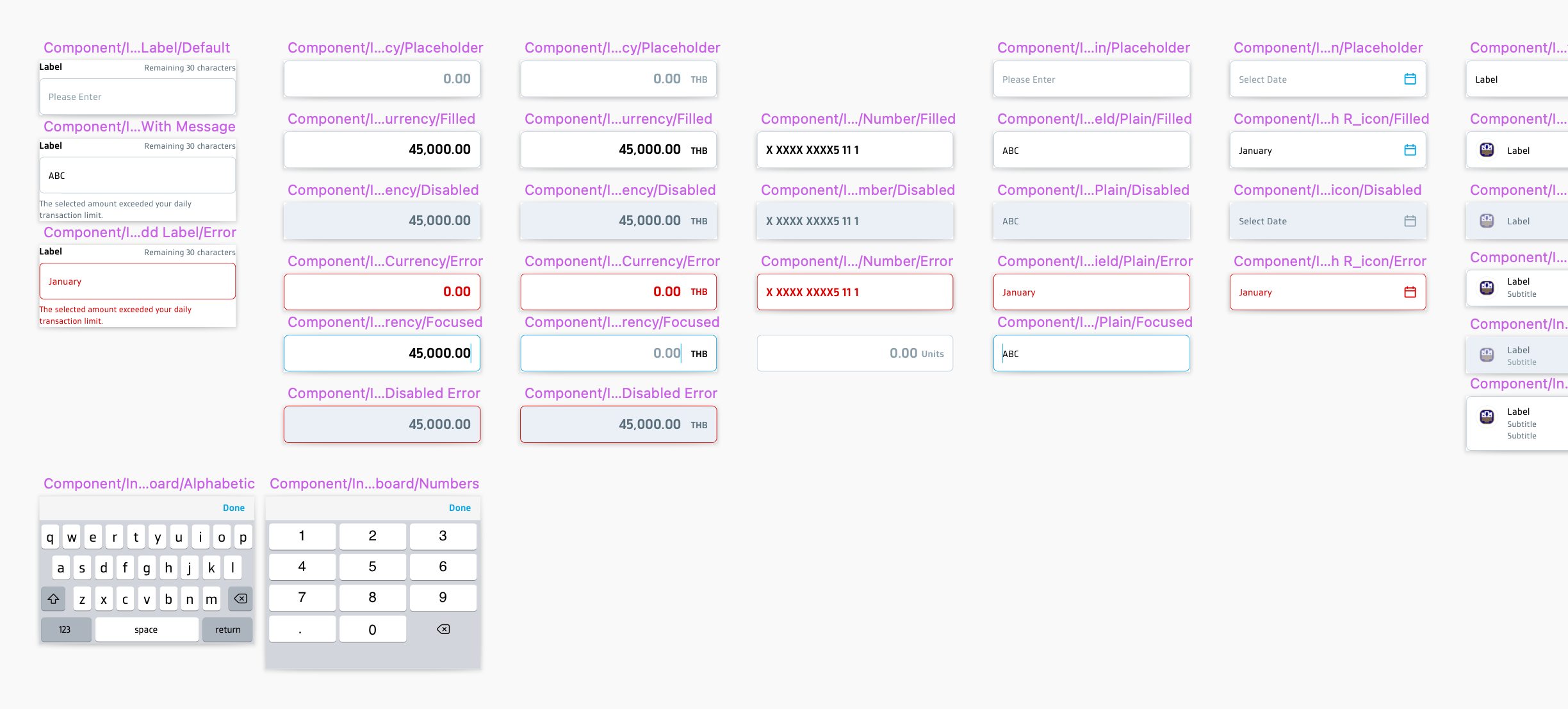
Auditing the existing product
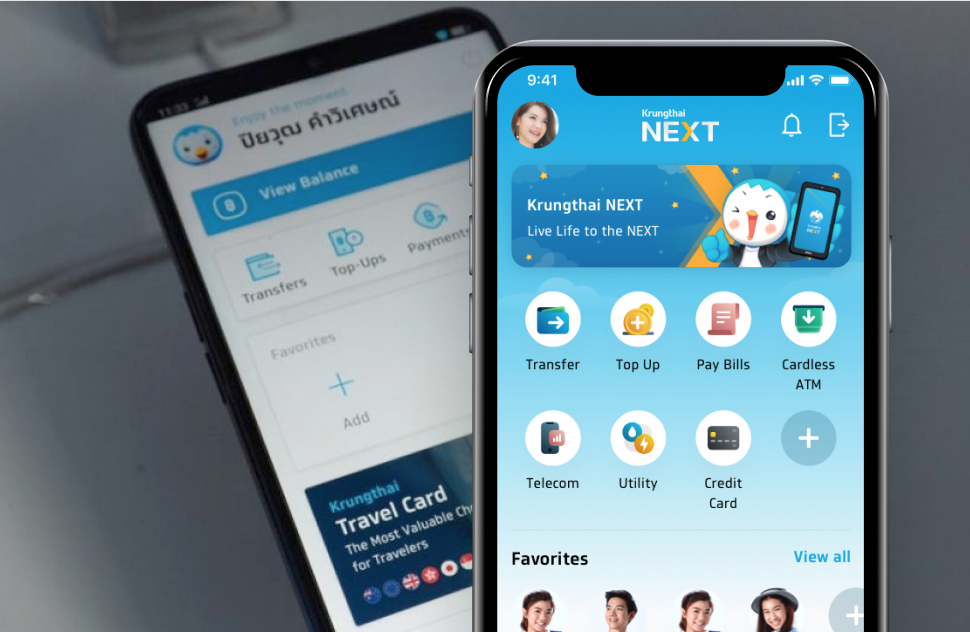
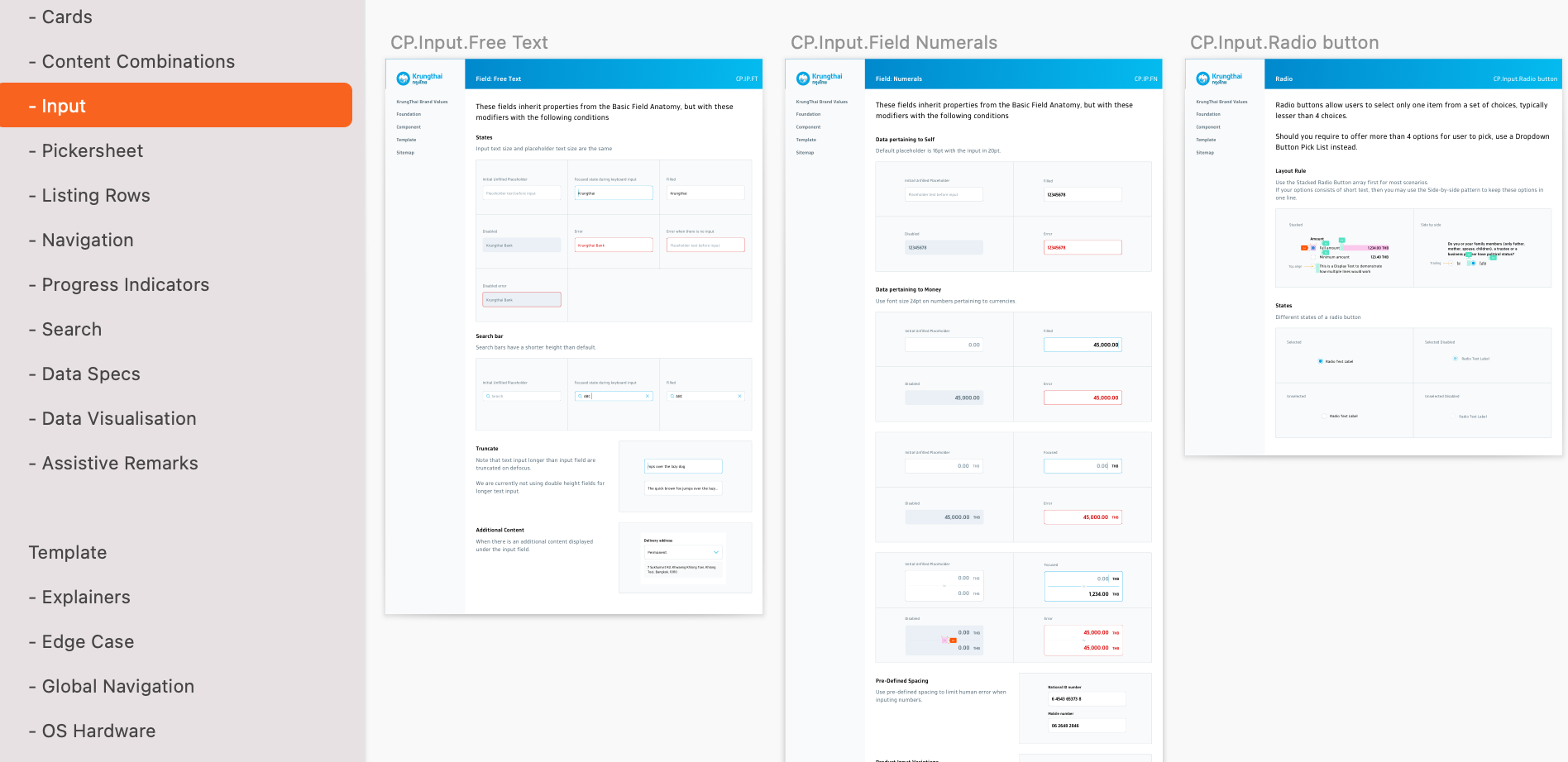
The client already had an existing app, so as a start I did an audit on their working files and captured the necessary design patterns that were vital for the refresh.
Moving forward, I worked on categorizing and updating each component, yet at the same time keeping their core brand identity.
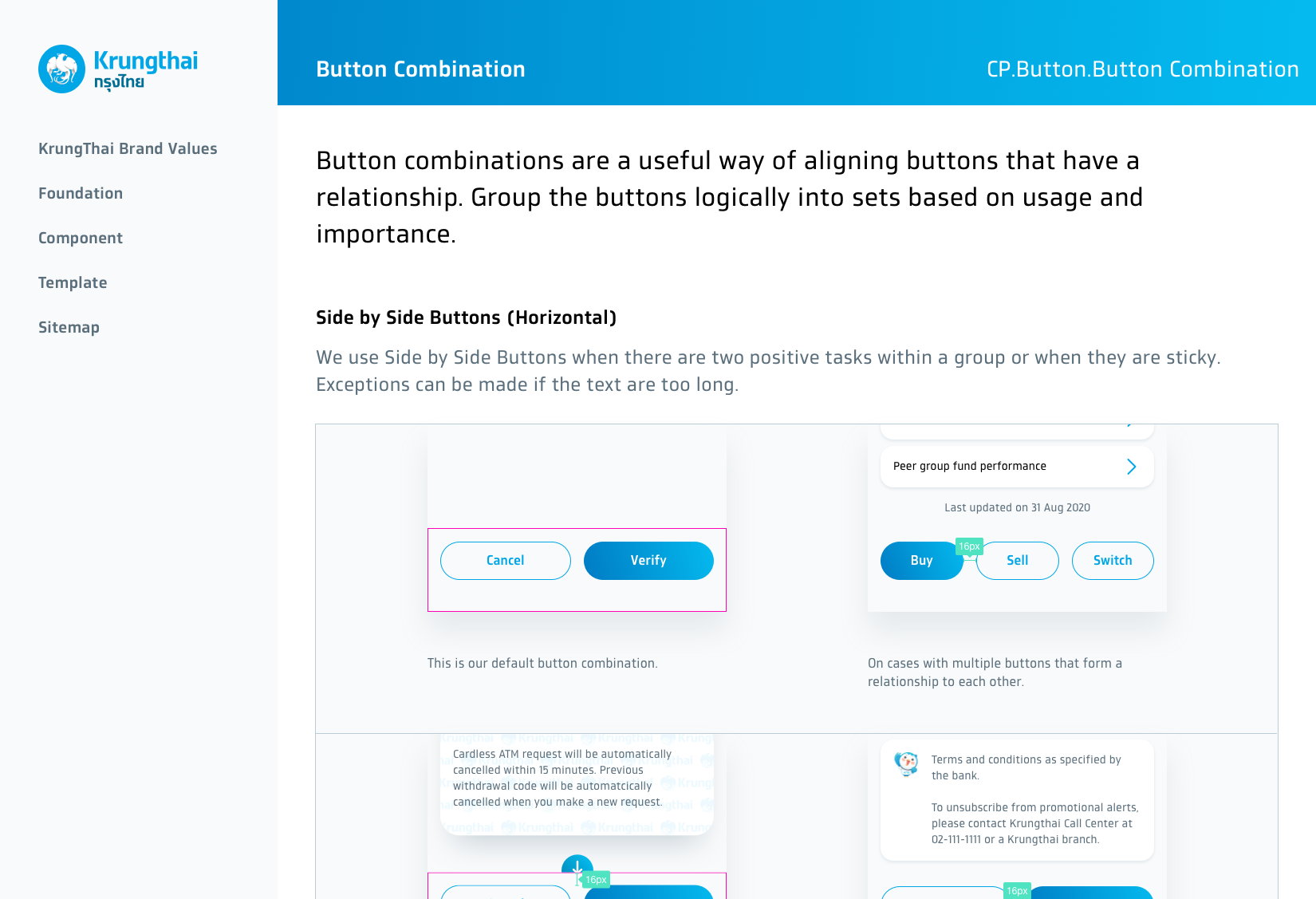
Establishing the design system
We worked together with the in-house experience team to come up with the initial design direction for the product. This included the design basics such as colours and typography. During my time there, we also spearheaded the motion-interaction guidelines, imagery principles and created the illustrations design kit.
Design exploration workshops
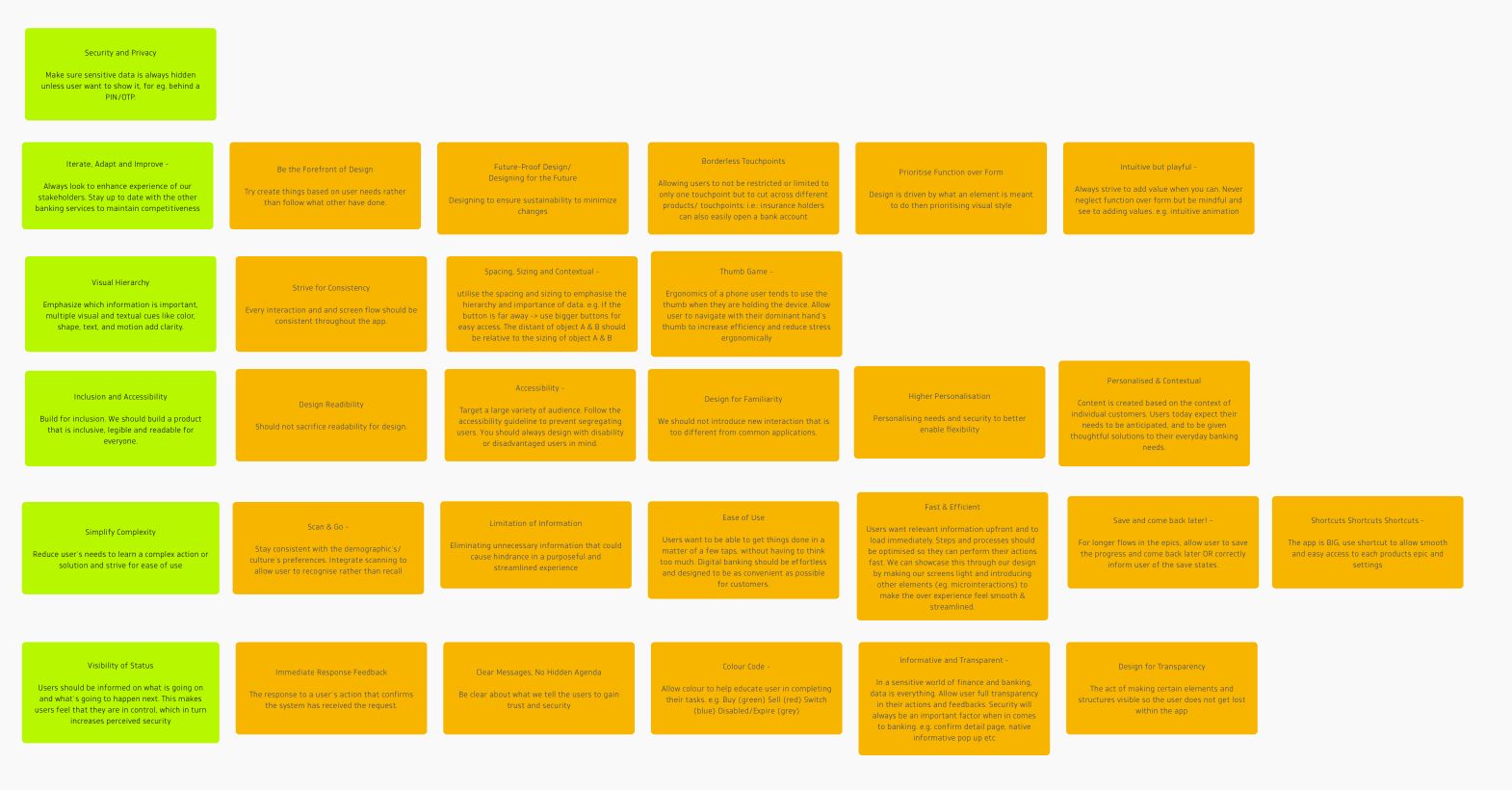
We ran numerous design exploration workshops to understand more about the product and explore opportunities within the brand. The results of these workshops, such as the Design Principles workshop, gave clarity on how to scale the design.
Designing an epic
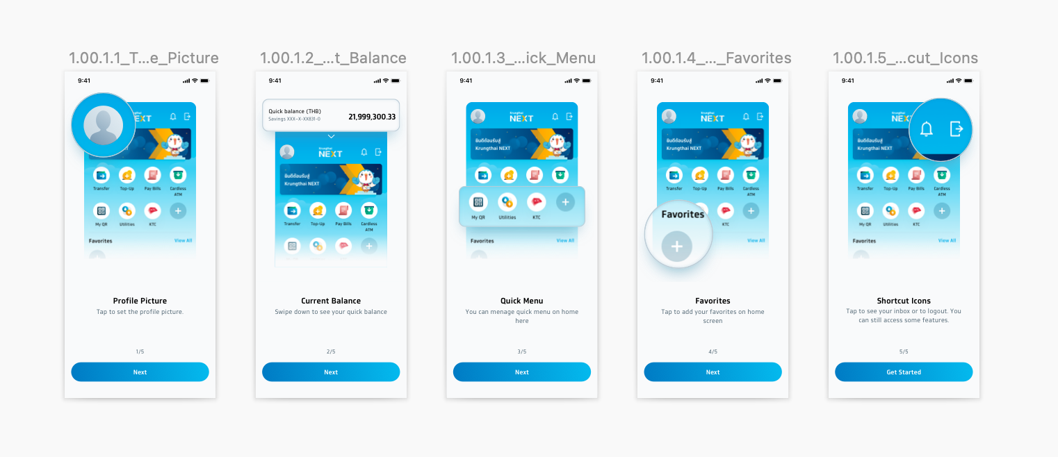
We start each epic (aka 'feature') with a stakeholder's meeting to get an understanding of the pain points of the current app, as well as to identity potential improvements.
After creating the initial user flow, we run multiple rounds of reviews, both internal and external, for further refinement and to ensure a consistent experience throughout the app.
Development Process
The product was developed with dedicated ios and Android teams. As the developers were closely involved in the planning process and with the design system as a source of truth, the transition from design-to-code was effortless. Every epic will go through a series of UAT testing on the SIT environment. Each bug was logged and its fix status was kept tracked through JIRA and weekly scrum meetings.
This provided greater transparency between cross-functional teams.
Outcome
We created over 255 pages spread across 34 sections for the design system within the first 6 months. An illustrated kit was established to help designers create illustrations fast with the given assets.
During my time there, the experience team grew from three designers to eleven designers. We completed over 50 epics over three MVPs. The product was successfully launched nationwide in 2020.