Unifying the experiences of Next Level Trading
I created a design system that provided a unified set of UI, design rules, and patterns. The design system was able to support quick wireframing and provide a consistent experience for applications and websites in Figma.
CLIENT
[Redacted]
DURATION
8 months
TOOLS
Figma
METHODOLOGY
Design system
Background
A major crypto company had been designing without a design library. This created design inconsistency issues across its product and the lack of clarity meant that components were often wrongly used. As the product is expanding at an exponential rate, a greater emphasis on a design system is needed.
Building the components
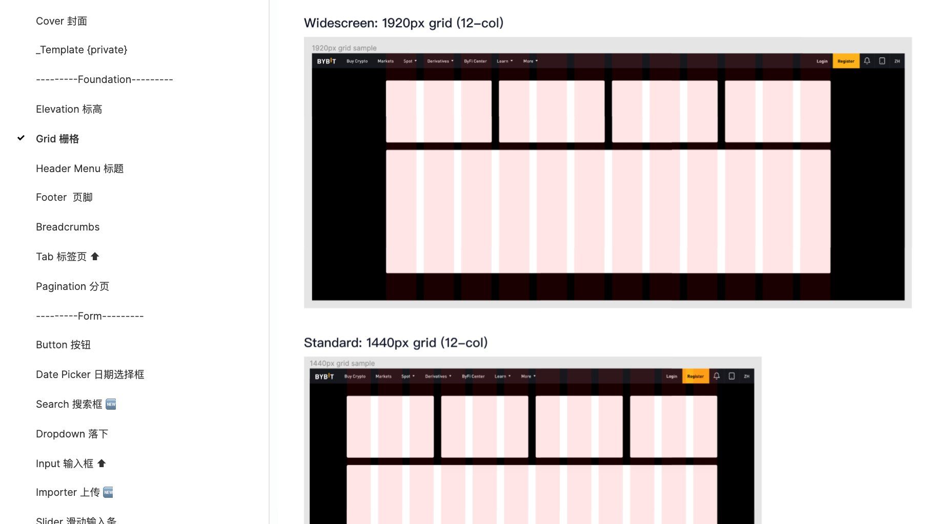
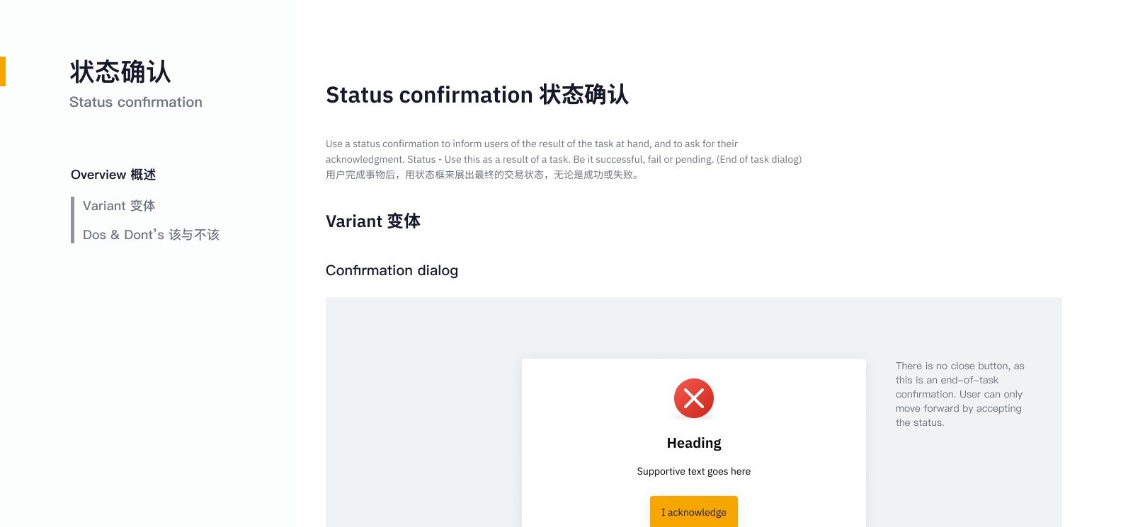
The Figma components were created for flexibility in mind, using variants and auto-layout. I had looked into the current assets from all the way back to 2019 to source common components to start building the system. I stress test each component for both dark and light mode, and design standards such as WCAG contrast. Components that failed these standards would be refreshed to provide better usability for the users.
Structuring for different platforms.
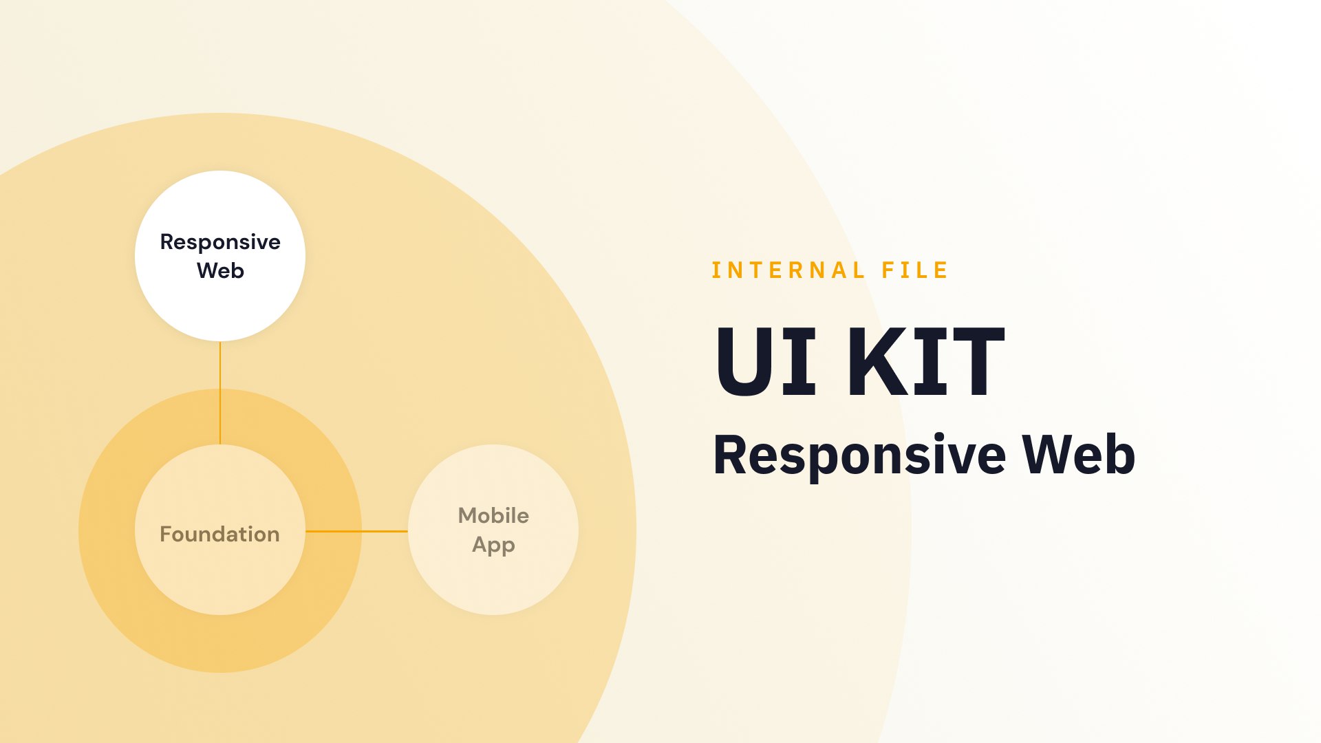
I created three design systems, with each covering a platform; web, app, and foundation. The web and app design systems share the same component used in the foundation such as iconography, colours, and typography. Whereas, the web and app design system will have their components designed natively to their platform. As each platform have their own native interaction and limitation.
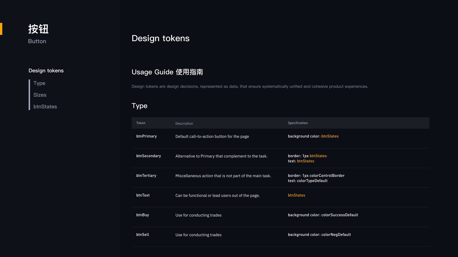
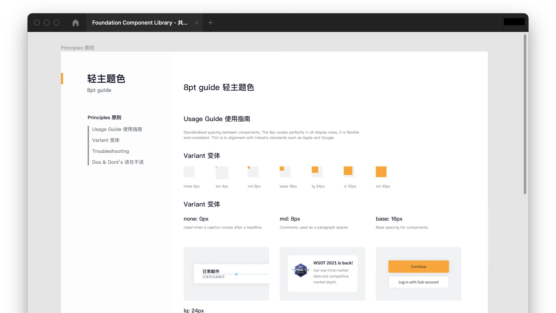
Design tokens
The library was built with design tokens in mind. Design tokens help developers to understand the relationship between components. It contains values that makes up the design system and provide a way for me to mantain control of the system.
Roadmap
The current development process did not have any dev component library due to the lack of a design system - this resulted in duplicate bugs when doing UAT. Moving forward, I reached out to the dev lead of both app and web to start creating a dev component library. As part of the roadmap, the gap between the experience team and the dev team will be bridged through the design system in the future.